Grist recently cross-posted an article by Per Square Mile’s Tim De Chant which mines an old (2009) study from the Journal of Urban Economics to argue that “only the steepest increases in density could reduce car usage”. Unfortunately, I think that’s entirely the wrong conclusion to draw from the study.
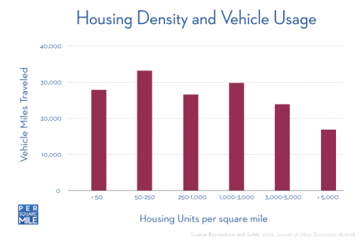
Here’s the key graph that De Chant writes about:

And here’s why I think De Chant is drawing faulty conclusions:
A. “VMT only really declines substantially at the highest housing density—over 5,000 units per square mile, or about the same as Chicago.”
There is no reason that the graph should stop at 5,000 units per square mile. New York City — not ultra-dense Manhattan, but the city as a whole — is nearly double that1. (It seems really odd to me to not include a datapoint for New York City on a chart about American urban density.) Major European cities (Paris, Athens, Barcelona, etc.) are twice that again. And global megacities (Cairo, Manila, many cities in countries like India and Indonesia, etc.) are even denser, three to even four times the density of New York City. Even if you throw out those cities as unacceptably dense (though I wouldn’t, at least without defining unacceptably), it’s hard to argue that Paris or Barcelona aren’t pretty desirable places to live. You can make the argument that such density is so unrealistic that it shouldn’t be a goal for American urbanists, but if you’re trying to quantify the value of various kinds of density, it’s bizarre to not even talk about the options.
B. “To halve VMT of the highest mileage households, you would need to increase housing density in those areas by 20- to 100- fold.”
In other words, to reduce the VMT of households in rural West Virginia, you would need to increase density in those areas to Chicago levels. But no urbanist I’m familiar with is talking about turning West Virginia into Chicago. Urbanists are interested in things like densifying inner-ring suburbs, or removing restrictions on new construction in already-dense areas. In the context of the chart, moving people from the fourth column to the fifth, or from the fifth off the chart. Yes, those are still difficult things to do, but they’re not absurd like the 20-to-100-fold increase De Chant describes.
C. The most important (and most wrong) argument in the piece is this: “Density is responsible for a fraction of annual VMT”.
This is literally not what the chart shows. The chart indicates — predictably — that moving from a typical built-up suburb (density of 1000-3000 hh/sq.mi.) to the only portion of the chart that actually qualifies as significant density (>5000 hh/sq.mi.) nearly halves VMT. If the chart were extended to the right to show further densities — New York City’s, European, global — then I predict (I am going out on a limb here) that it would continue to decline. Signficantly. (I feel pretty safe in further assuming that the decline would not be linear, but increase rapidly as you reach densities at which car travel becomes less and less practical.)
SF.Streetsblog posted a short item from Peter Calthorpe early this year which discussed the extremity of variance in VMT between neighborhoods in the San Francisco region. I’ll quote a piece of it:
“…a typical household in the Russian Hill neighborhood of San Francisco has an average VMT of 7,300 miles a year. This neighborhood averages only three stories but is dense by suburban standards; has a rich mix of shops, restaurants, and services within walking distance; and is a short transit ride from downtown…
The Rockridge neighborhood in Oakland was created as a streetcar suburb back in the prewar days of the Key Route Trolley system, which connected most of the Bay Area until 1948. It is filled largely with bungalow and small-lot single-family homes but has small apartment buildings at corners and a wonderful mixed-use main street along with a BART (Bay Area Rapid Transit) train station at its center. The average household there drives about 12,200 miles a year… Out in San Ramon, a low-density East Bay suburb without good transit connections, development patterns fit the standard sprawl paradigm, with isolated single family subdivisions, strip commercial arterials, malls, and office parks. VMT for the average home there is around 30,000 miles a year…
So there is a four-to-one range in travel behavior over three neighborhoods in one region.”
While the plural of anecdote is not necessarily data, I see nothing in the chart De Chant posted which would indicate that Calthorpe’s examples are outliers.
D. All that said, here’s what I can agree with De Chant on — increasing fuel economy is an extremely important project and densification is a slow, long-term project. (mammoth has always argued for the importance of appreciating the slowness of change in urban systems.) But bad interpretations of poorly-framed charts are only going to make the latter more difficult, and that’s why De Chant’s post is particularly unfortunate.
[If you’ve been reading mammoth for a while, you’ll probably think this is kind of an odd post, given our frequent arguments for the importance of understanding, working with, and valuing the American suburb. We like to hold these things in tension — esteem for the virtue of dense, urban living and an appreciation of both the many reasons that Americans have traditionally valued suburban living and the strange vitality of the suburbs as the United States’ most iconic urban form.]

