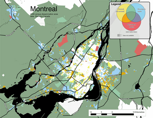
[“Montreal: Percentage of residents who drive to work, live in single-detached housing, and own their homes”, from Moos and Kramer’s Atlas of Suburbanisms.]
The University of Waterloo’s Atlas of Suburbanisms — a research project by the School of Planning’s Markus Moos and Anna Kramer — looks like a fantastic effort to understand Canadian suburbs on their own terms and as components of larger urban systems:
“…what if we mapped characteristics commonly believed to be telling of suburbs just to see where they actually occur? What if we went to the suburbs, figuratively and literately, and conducted research as if looking from one suburb to the other, or as if looking from a suburb toward the central city? The likely result is an understanding of suburbanism, and our cities more generally, that is richer and more diverse; an understanding that does not take for granted the political or historic development of cities as drawing concrete lines between what we believe is the suburban and the urban.”
To do this, the research relies on a shift from understanding suburbia primarily as a spatial format — defined by distance from the center of a city, by a certain level of density, or by particular ways of arranging streets and buildings — towards understanding suburbanisms as a kind of urbanity constituted by certain patterns of living: driving to work, gravitating towards demographic monocultures, retreating from public space towards semi-public and private space, owning rather than renting.

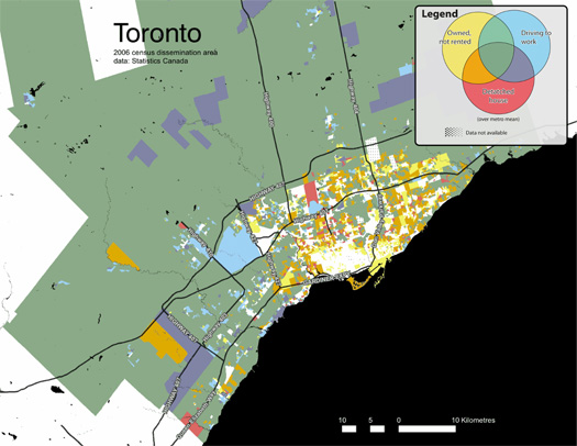
[“Toronto: Percentage of residents who drive to work, live in single-detached housing, and own their homes”, from Moos and Kramer’s Atlas of Suburbanisms.]
This is not a new idea, of course, as the authors of the Atlas acknowledge in referencing Henri Lefebvre. (And the tradition of understanding urbanism “as particular ways of living” goes back to Louis Wirth’s Urbanism as a Way of Life, and Park and Simmel before him.)
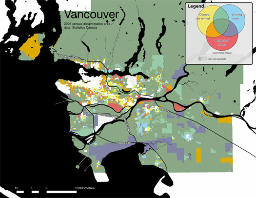
What is novel — to me at least — is the mapping work included in the Atlas, which extracts a set of variables from Canadian census data — on driving to work, home ownership, and detached housing — to create a series of maps of that treat the overlap between these variables as a kind of spatially-distributed Venn diagram (the key is literally a Venn diagram), producing a first draft of mapping suburbanism as a continuum from less suburban to more suburban.
Though two of these variables might really be considered behaviors and one of which is a spatial format, it seems to me that also overlapping different ways of understanding urbanization — sitting on both sides of that shift from suburbia as a spatial format to suburbanisms as ways of life — makes the mapping work stronger because, while it may detract from the purity of the thesis, urbanism is genuinely defined by both spatial and behavioral patterns.

[“Vancouver: Percentage of residents who drive to work, live in single-detached housing, and own their homes”, from Moos and Kramer’s Atlas of Suburbanisms.]
If anything, it’d be fascinating to see the maps become more and more fragmented. The current simple Venn diagram of a key might start to exhibit fractal behavior as it splinters into endless combinatory possibilities. The variables could expand to include more spatial variations — cul de sacs, highway configurations, architectural styles, maximum building heights, building life-spans, chain-store ecologies and big box indicator species — and near-infinite lists of behavioral patterns: the propensity to start families, the kinds of schools attended, whether demographic homogeneity is increasing or decreasing, the kinds of crimes that are most prevalent, modes of transport taken on basic errands, which cultural institutions and social spaces play the most central role in daily life (from bars to places of worship to ballparks to public squares). And then the kinds of variables under consideration could expand: understanding cities as economic entities, as material networks, as infrastructural assemblages…
[Seen via Nate Berg.]


Thank you for sharing these maps.
One consideration with the map suggestions you’ve proposed in the last paragraph is that the number of shades needed to represent that many overlapping data layers on one map would very quickly escalate beyond the Venn Diagram color model employed currently, and would instead necessitate needing a shading system from (e.g. from white to black) indicating to the degree of “urban-ness” of an area. But that would lead to the drawback of less specific information being contained, and the viewer relies more on the map-makers judgement of what constitutes being “urban”, and less on deciphering their own trends from the data.
The thing I had in mind but didn’t say explicitly is that it seems like the attempt to construct an ever-more accurate model of the continuum of suburbanisms would quickly attain Borgesian dimensions, with the both the key and the map disintegrating into a cascade of unreplicated individual pixels of color (no two households having exactly the same overlaps). Which is more entertaining than it is useful, but entertainment is also its own use…
*culs-de-sac
I can’t speak for Canada, but in the United States there are numerous suburban communities–municipalities outside the central city–with large numbers, even majorities of renter-occupied housing. I don’t think you can use that as a defining characteristic.
The mapping bears this out for the Canadian cities studied, as well — note the large swathes of blue, purple, and red areas (all of which indicate majority renting) in the outlying portions of the images above.
Rather than a flaw, this seems like a strength of this method of mapping: you can see that certain patterns of living which are stereotypically suburban (home ownership) do not apply evenly to what spatial distribution (distance from city center, for instance) would tell you are “suburbs”.
(I do think that home ownership is part of the stereotypical understanding of what is suburban — the role of suburban life within the American Dream, etc. — even though, as both you and the maps themselves correctly point out, reality is more complicated.)
Pretty sure you have seen these:
http://projects.nytimes.com/census/2010/map
But wanted to bring them up here, to point out their big flaw, which is the inablilty to overlay the different conditions which would begin to expose cultural/racial/economic. I think this overlaying is the thing that you are talking about and I think it is an excellent point.
I also think that these are part of a larger group of maps that map non-spatial relationships. This brings the cultural/racial/economic into a direct spatial expression.
The other end of the spectrum in these are spatial maps that reveal the cultural/racial/economic. As recently shown on the Funambulist:
http://thefunambulist.net/2012/06/01/palestine-the-cartography-of-road-segregation-by-visualizing-palestine/