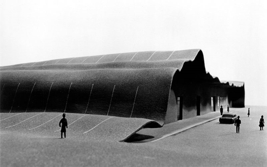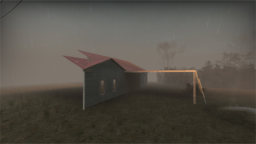
[A model from SITE Architects’ series of projects in the seventies and eighties for BEST Products Company; I don’t think this particular one was built (I’d like to be told I’m wrong about that), but those that were built are also rather entertaining, and early examples of attempts to modify the architecture of big-box stores.]
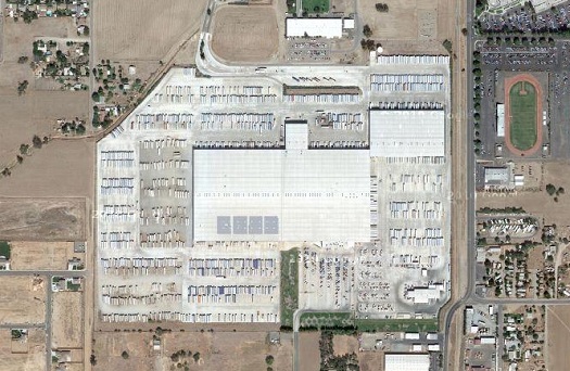
I thought that, having discussed distribution in a relatively abstract manner, it might be interesting to look at some particular architectural proposals for distribution. (To be clear, these are quick looks, not careful readings.)
If there is a common thread here — and I don’t know that it is necessarily particularly important to find one — it might be the effort to re-program, to seek new typologies that might negotiate between the desire for a healthy public realm (which is something these architects bring to distribution) and the spatial demands inherent in the logic and logistics of distribution.
A. DUCK-AND-COVER
Roger Sherman Architecture and Urban Design
[portfolio_slideshow include=”3255,3257,3250,3258,3253,3254,3260,3251,3252,3261,3262,3256,3337″ size=full]
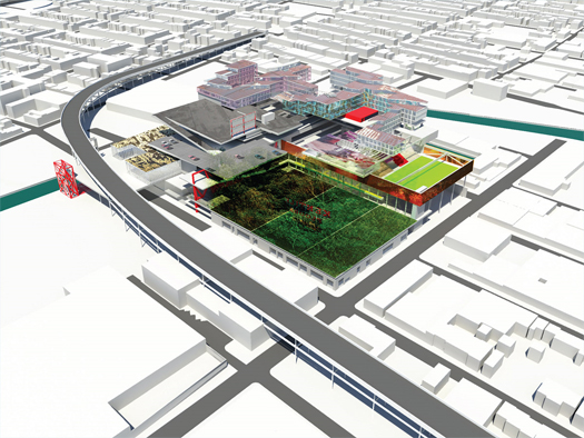
Those who have been reading the Infrastructural City along with mammoth will probably recognize Roger Sherman as the author of the chapter before “Distribution”, “Count(ing) on Change”. In “Duck-and-Cover” Sherman proposes both an architecture and a business plan, aiming to create a series of new identities for Target stores — “Target Green”, “Target Town”, and “Target Play” — which bundle public spaces with specialized big-box architectures which cater to more narrowly conceived audiences than the traditional Target store. Each aims to offer something to the surrounding community which is missing in its context — thus “Play”, for instance, is situated on an “infill site in open-space starved Brooklyn”.
B. FLATSPACE
Lateral
[portfolio_slideshow include=”3290,3291,3292,3378,3379,3380,3381,3382″ size=full]
Many of mammoth‘s readers are presumably familiar with Lateral (Mason White and Lola Sheppard); “Flatspace” is one of their earlier projects, circa 2003. (Some of the images above are taken from Lateral collaborator Neeraj Bhatia’s The Open Workshop.) I’ll let text from Young Architects 7 describe the project:
“As exurban growth is increasingly consumed by agglomerating retail corridors, its single-use status begins to systematically redefine public space at the margins of cities. This assembly of highways and paved planes is dominated by big boxes and retail power centers, conflating an ever-evolving consumer culture with public space. In this environment, public space as an indeterminate open system has been supplanted by a highly controlled environment of familiar homogeneity. The possibilities of intervening in this exurban condition, what we call “flatspace”, on its own terms remain overlooked.
Detached from a larger, complex spatial network, flatspace is comprised of autonomous adjacencies of selfsame components–big box, parking lot, landscape lining. Accessed or linked only by stretches of asphalt within the confines of an automobile, flatspace limits the physical contact of bodies. In its subordination to the car and the ease of mobility, flatspaces are places of sterile transit, or nonplaces. The potential for design in flatspace is less about inserting a foreign program or form and more about positing that the system can recalibrate existing elements and agitate encounters of the public without altering its capitalist dependency on efficiency and geoeconomics.
A typical retail corridor in Columbus, Ohio, served as a case study. Three filters–program, parking, and landscape–are used to test alternate organizational strategies. Each contains three strategies of recalibrated protocols for organization. The nine networks are not intended as design proposals but as strategies or tactics for emergent relationships already at work within exurban corridors.”
When we talk about expanding the territories that we consider in designing a work of architecture (as mammoth often does), one interesting question that is raised is whether we respond with tactics that are seeking to accommodate these influences in a more expansive way, or with tactics that seek to use the act of architecture as an opportunity to alter the processes influencing that territory.
What makes “Flatspace” such an interesting project — and different from many architectural proposals for big-box stores and ex-urban landscapes — is that it is an example of the latter. It emgages the spatial logics which define those architectures and landscapes, and in doing so shows a series of ways in which the logic (and extended context) of the ex-urban landscape becomes an opportunity to re-configure that landscape.
You can watch videos explaining in depth three of the nine networks — “Pixelscape”, “On-Off Ramps”, and “Confetti” (the same three included in the slideshow above) — at The Open Workshop.
C. STUDY FOR WAL-MART
University of Arkansas Community Design Center
[portfolio_slideshow include=”3347,3348,3349,3350,3351,3352,3353,3354,3355,3356″]
The UACDC’s “Study for Wal-Mart” aims to construct “viable civic expressions” within the “generic development protocols” of the big-box landscape, focusing on the zones of transition between different components of that landscape — “from public street to store checkouts” — which the Center refers to as “ecotones”. For larger images, click through to UACDC’s site.
D. THE SUBURBAN GENERAL STORE
R&DAR
[portfolio_slideshow include=”3359,3360,3361,3362,3363,3364,3365,3366,3367,3368″]
The R&DAR team (which, in another connection to The Infrastructural City, includes Frank Ruchala, who wrote “Crude City”), like Sherman’s team, proposes both a set of architectural elements and a business plan — though, in comparison to Sherman’s proposal, their proposal probably emphasizes the business plan more heavily and the (traditional) architectural elements less heavily (which is not to say anything about the relative merits of the proposals). Perhaps the most interesting aspect of the proposal is the attention that R&DAR paid to how a typical existing zoning code might be artfully modified to support the viability of their proposal — a small hack, perhaps, but one which suggests just how fruitful a willingness to carefully read and think through the impacts of such dull legal texts might be.
For further reading: Free Association Design brings up RTVR’s “Post-Carbon Highway”, which focuses on another landscape of distribution, transport corridors. Check out Brett’s post, and read more at Alphabet City. Also: we’re testing a new capability here — slideshows — and I’m guessing there’s a bug or two we haven’t encountered yet. If you see something (or don’t see anything), let us know.
Pixelscape
The pixel scheme begins by ‘lowering the resolution’ on the current landscape, in order to read it as a series of patches. In digital terms, a pixel is, in fact, composed of three colors that oscillate between varying degrees of purity. Here, pixel types correspond to surface types of building, parking and landscape. Zones of pixel corruption are introduced, and hybridized pixels emerge. The resolution is then ‘turned up’ again, revealing a new ‘impure’ landscape. It is in these ‘impure’ landscapes that hybrid conditions emerge – a mixing of programmes and modes of transport. These hybrids encourage unlikely encounters which contribute to the public sphere.


